Renewed Serenity: The Visual Identity of a Reinvented Chapel
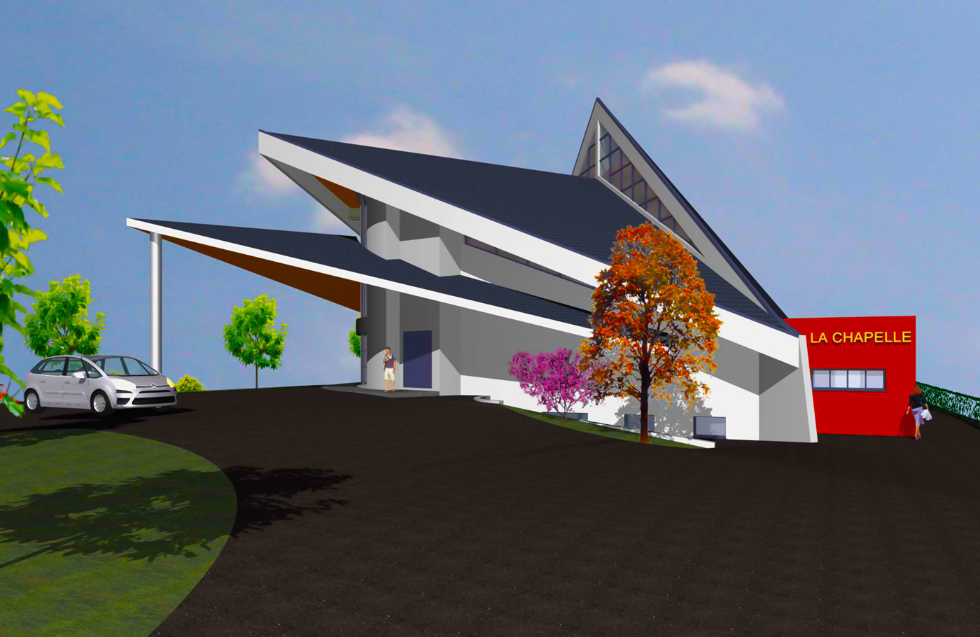
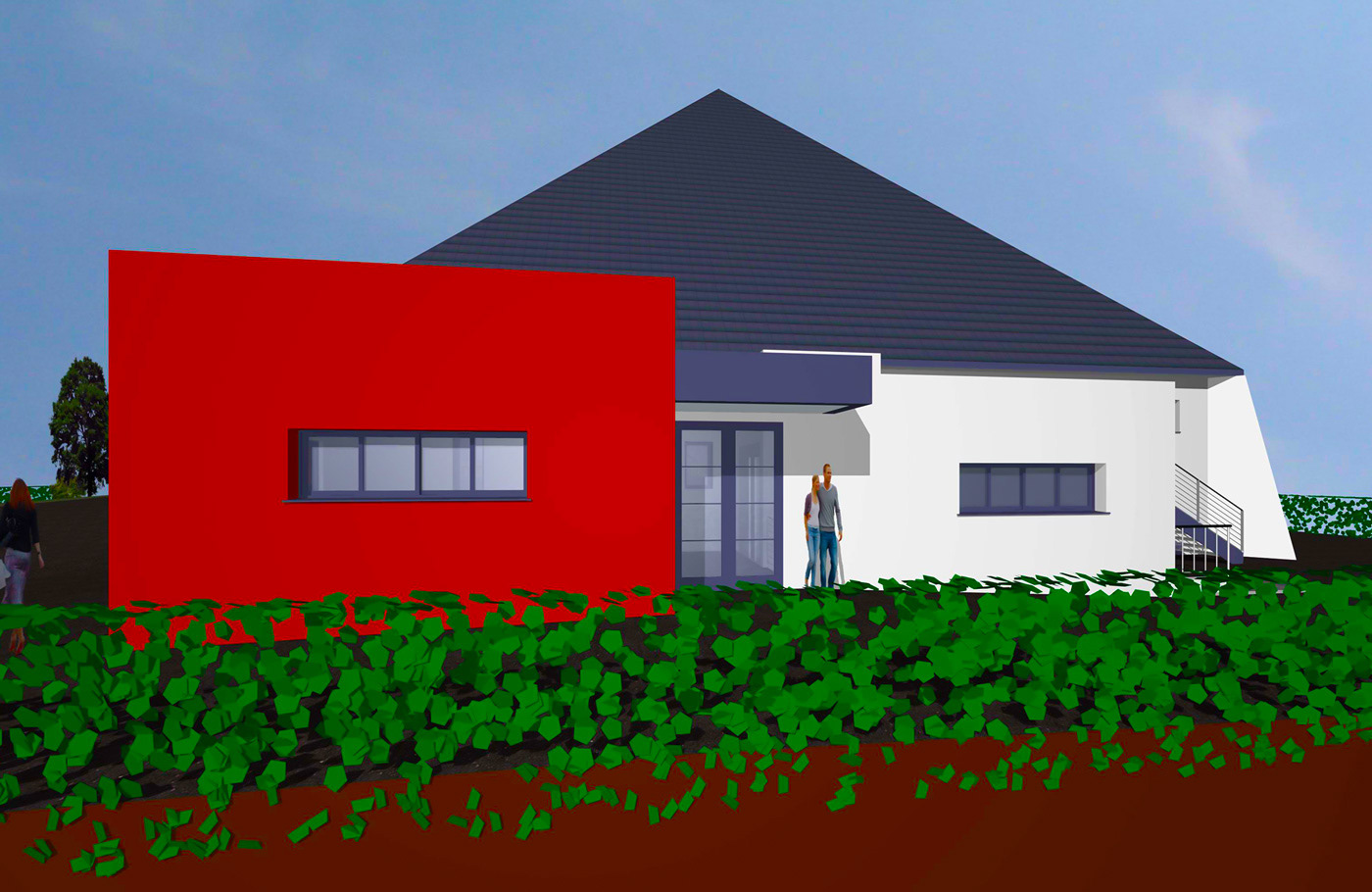
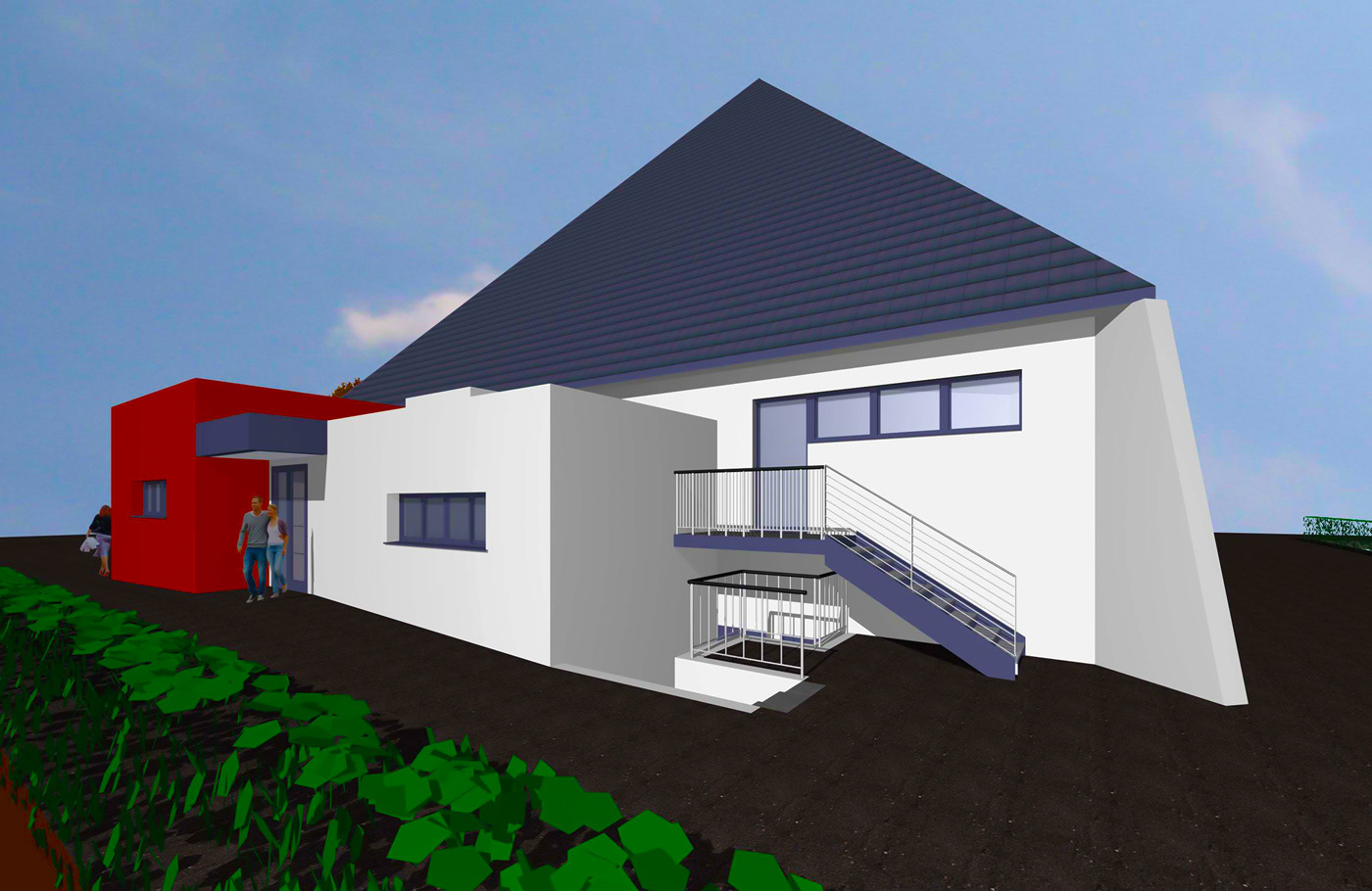
The historic Sainte-Odile chapel in Wintzenheim, Alsace, is to be rehabilitated. Designed by the architect Joseph Muller in 1963, The Chapel (La Chapelle) will be transformed into a place of worship for the Assembly of God evangelical church (Assemblée de Dieu). The renovations, estimated at 450,000 euros, would create a welcoming and accessible space of 800 square meters, with the capacity to accommodate close to 500 individuals.
Project Objectives:
➜ Establish a distinctive visual identity that reflects the architecture and the values of openness and exchange.
➜ Conduct an engaging fundraising campaign to finance the extension of The Chapel (La Chapelle).
➜ Communicate effectively about the project to generate excitement for the reopening.
Role and Responsibilities:
➜ Design a unique and memorable visual identity that captures the architectural essence of The Chapel (La Chapelle).
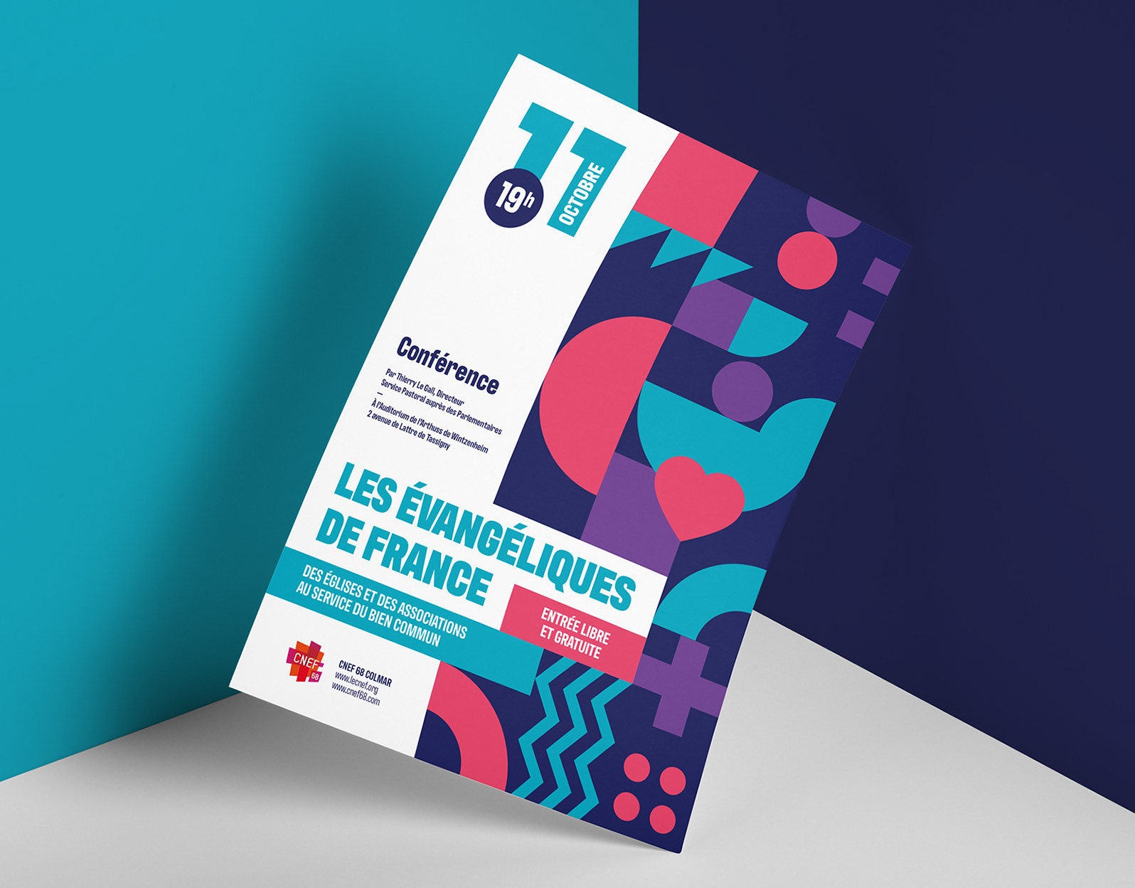
➜ Create a brochure, stationery, and an attractive dynamic presentation to promote the project.
➜ Manage the project's progress while adhering to deadlines.
➜ Oversee the production and printing of communication materials.
Results and Deliverables:
➜ The visual identity, which reflects the unique architecture of The Chapel (La Chapelle) and its values of openness and exchange, has been well received by the community.
➜ The fundraising campaign was a resounding success, mobilizing the community and attracting generous donors.
➜ The communication materials, including a brochure, stationery, and a dynamic presentation, have sparked enthusiasm for the reopening of The Chapel (La Chapelle).
➜ The delivery of a complete graphic charter has ensured a consistent and recognizable visual identity for The Chapel (La Chapelle).
Symbolizes an openness dimension and forms a bond of solidarity.
Represents an open Bible and reinforces the idea of protection.
Symbolizes a place of passage, it is an invitation to cross it.
Conveys the idea of passage from earth to heaven.
The monogram forms a triangle, a symbol of the Trinity, pointing to the cross.
6) Rounded corners for more harmony with the monogram.



Conclusion:
The project to transform and renovate The Chapel (La Chapelle) has been triumphant on all fronts. The distinctive visual identity, the successful fundraising campaign, and the impactful communication materials have succeeded in engaging the community and generating excitement for the reopening of The Chapel (La Chapelle). I am proud to have contributed to the development and lasting establishment of the Assembly of God evangelical church in Colmar for over 8 years, supporting them in acquiring a modern and accessible place of worship.
The project to transform and renovate The Chapel (La Chapelle) has been triumphant on all fronts. The distinctive visual identity, the successful fundraising campaign, and the impactful communication materials have succeeded in engaging the community and generating excitement for the reopening of The Chapel (La Chapelle). I am proud to have contributed to the development and lasting establishment of the Assembly of God evangelical church in Colmar for over 8 years, supporting them in acquiring a modern and accessible place of worship.


